
What can be customized?
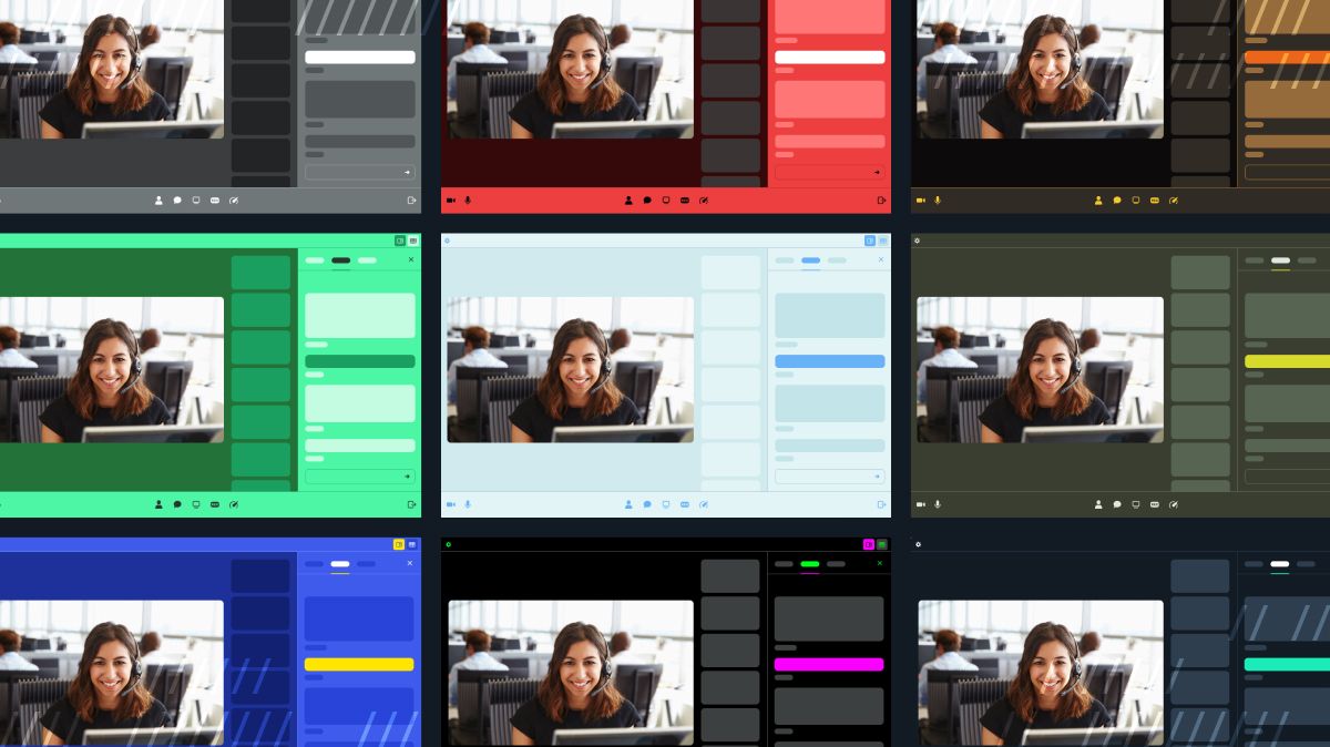
#AABBCC or #001122. You can specify as few or as many properties as you want. For example, you could give all ten properties a color. Alternatively, you could simply provide one, like an accent color, and leave the rest to use default values.
| Property | Description |
|---|---|
| accent | Main theme color. Used for primary actions and keyboard focus. |
| accentText | Text color rendered on accent. |
| background | Background color. |
| backgroundAccent | Background color for highlighted elements. |
| baseText | Default text and icon color, as rendered on background or backgroundAccent. |
| border | Default border color for bordered elements. |
| mainAreaBg | Background color for the main call area. |
| mainAreaBgAccent | Background color for video tiles. |
| mainAreaText | Text color for text rendered inside the call main area, e.g. names. |
| supportiveText | Text color for supportive, less emphasized, text. |
How do I customize the theme?
There are three ways to customize your theme:- Passing a
themeproperty tocreateFrame() - Passing a
themeproperty tojoin() - Via the
setTheme()method
createFrame()).
Options 1 and 2 are similar since they both receive the theme as a DailyCall property.
Option 3 (setTheme()) is used when you specifically only need to update the theme.
Let’s take a look at examples for each to see how these options work.
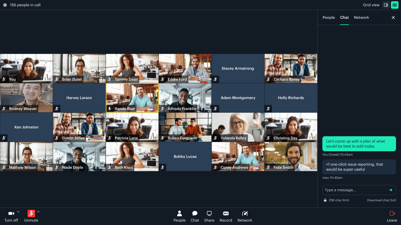
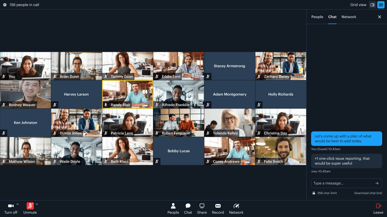
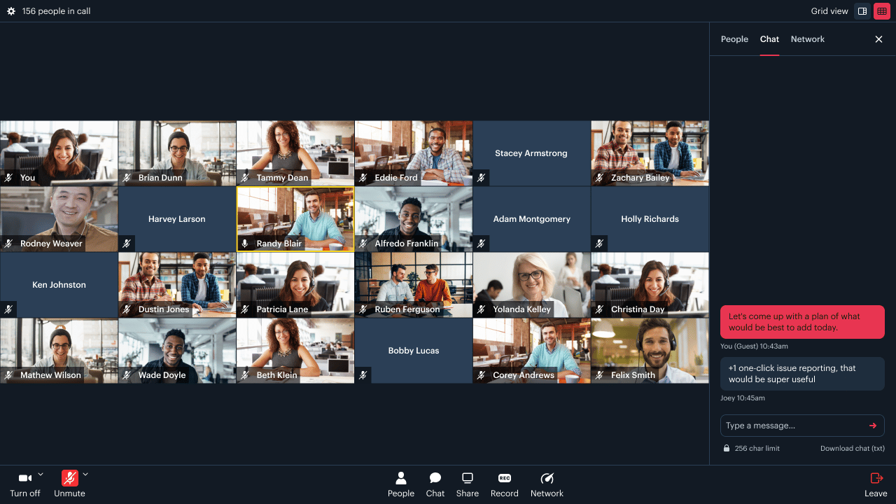
Updating Daily Prebuilt’s theme: Code examples
Let’s say you want to customize the accent color so it’s aligned with your brand. UsingcreateFrame():
join():
setTheme():
When applied during a call,
setTheme() overrides any color themes specified in createFrame() or join().accent. Remember, you can customize as many colors as you want, even all ten, effectively creating an entirely new theme!
But, many of your users might have a preference for either a dark or light theme, so we’ve provided a means for those to be customized individually.
Updating Daily Prebuilt’s dark and light mode themes: Code examples
Say, for example, you wanted to have a differentaccent color for each theme type:
accent color being customized:
accent color used:
Daily’s theme-updated event
Whenever a new theme is applied, we also emit a theme-updated event which contains the theme that was applied.
An example event payload, based on the setTheme() call above would look like:
Daily’s theme() method
Additionally, you can get the current theme at any point using the theme() method. Consider the following, where currentTheme would contain the same theme object as shown above:
Creating a full theme
accent), you can, of course, provide new values for all available colors to any of the aforementioned methods.
Here is an example of one global theme:
light and dark themes:
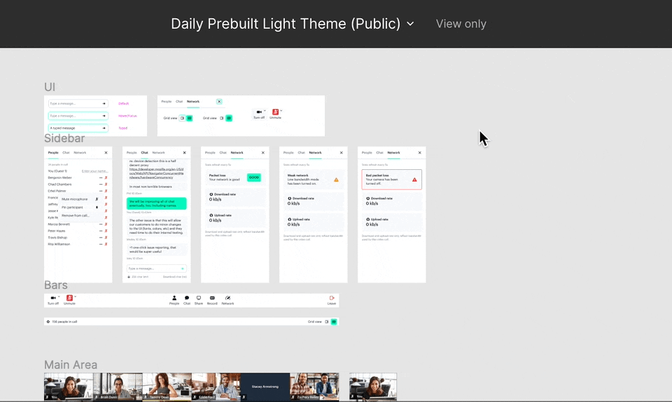
One more thing: prototype in Figma
To help you and your team design and preview your color theme, we have put together a few Figma files that will help you better visualize how the colors of your theme map to the individual UI elements of Daily Prebuilt. If you are a Figma pro, feel free to jump right in! Here are links to the default dark and light Figma theme files, respectively. If you aren’t, read on to learn how to use these files.Get started
Using the Figma files requires:- A Figma account, sign up if you do not have one
- A desktop computer and modern browser (like Chrome). Figma’s browser requirements.
- Your brand’s colors!
Modifying the Figma theme file
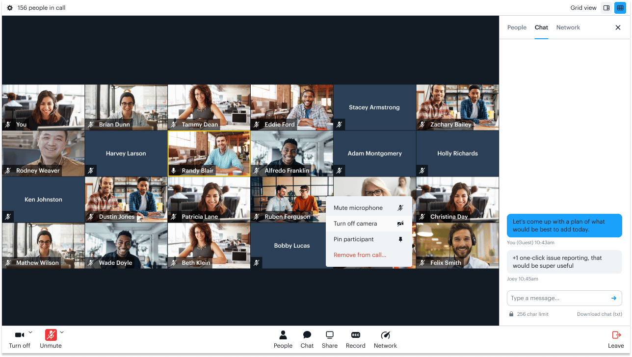
Themes are composed of 10, editable, color styles which are shown in Figma’s design panel—if you cannot view the styles, hit the escape key to deselect your current selection. Each style maps to individual elements that are spread across all of the mock interfaces. By editing these styles, you will be able to preview what your theme will look like in real-time.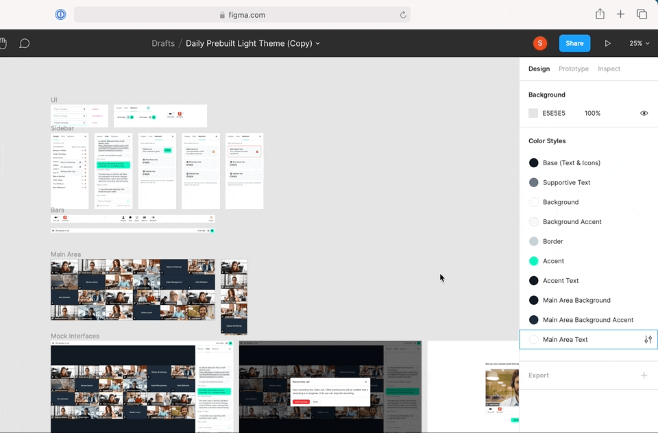
- Simply hover over a Color Style and click the edit icon.
- Then click on the fill color to choose a new color or enter a HEX value.
Certain elements are not editable at this time. These include system colors (errors/warnings), name/mic UI overlaid over participants video feeds, etc.
When dealing with color, you will want to consider how this impacts accessibility, in particular the color contrast. We suggest verifying this with a contrast checker.